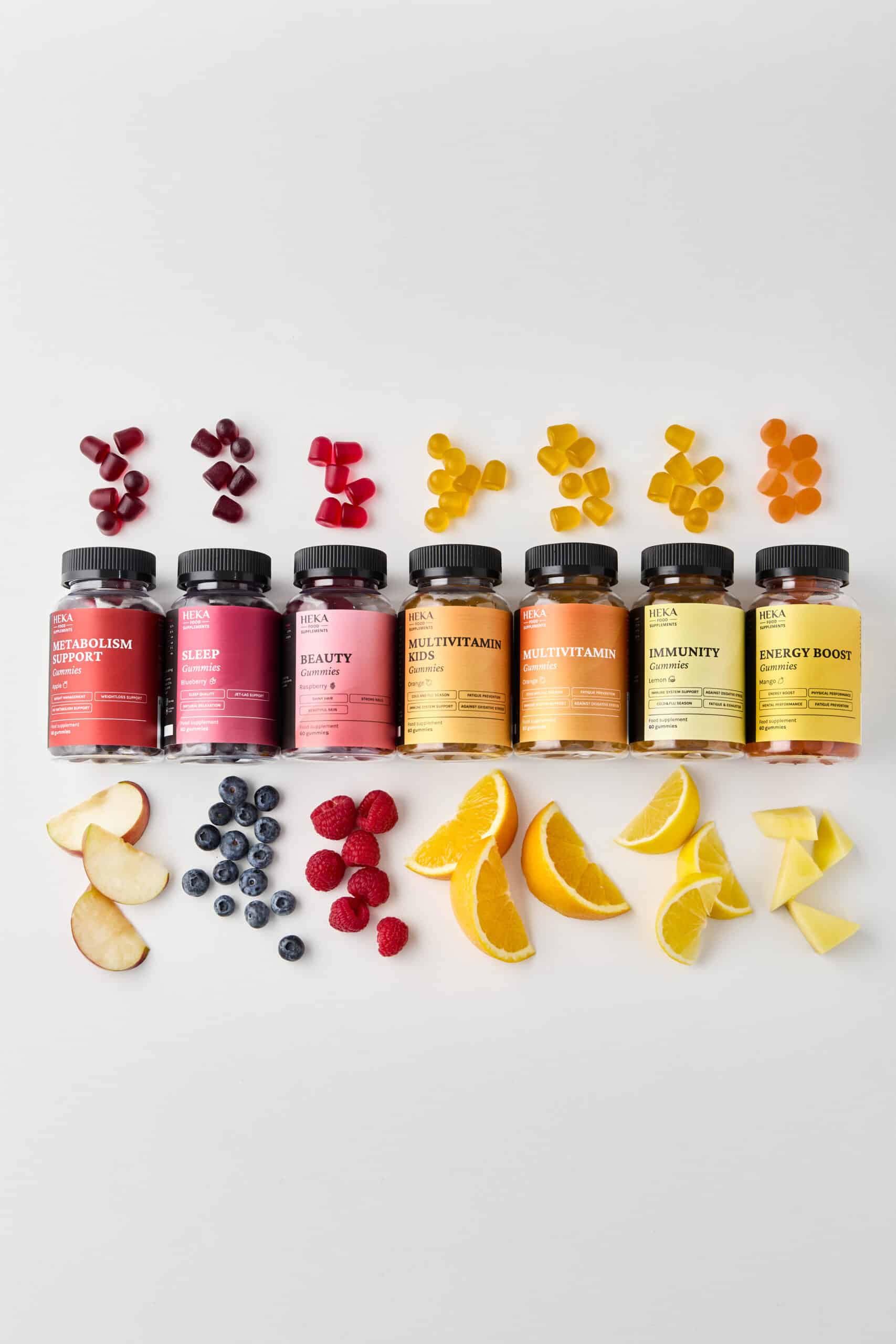


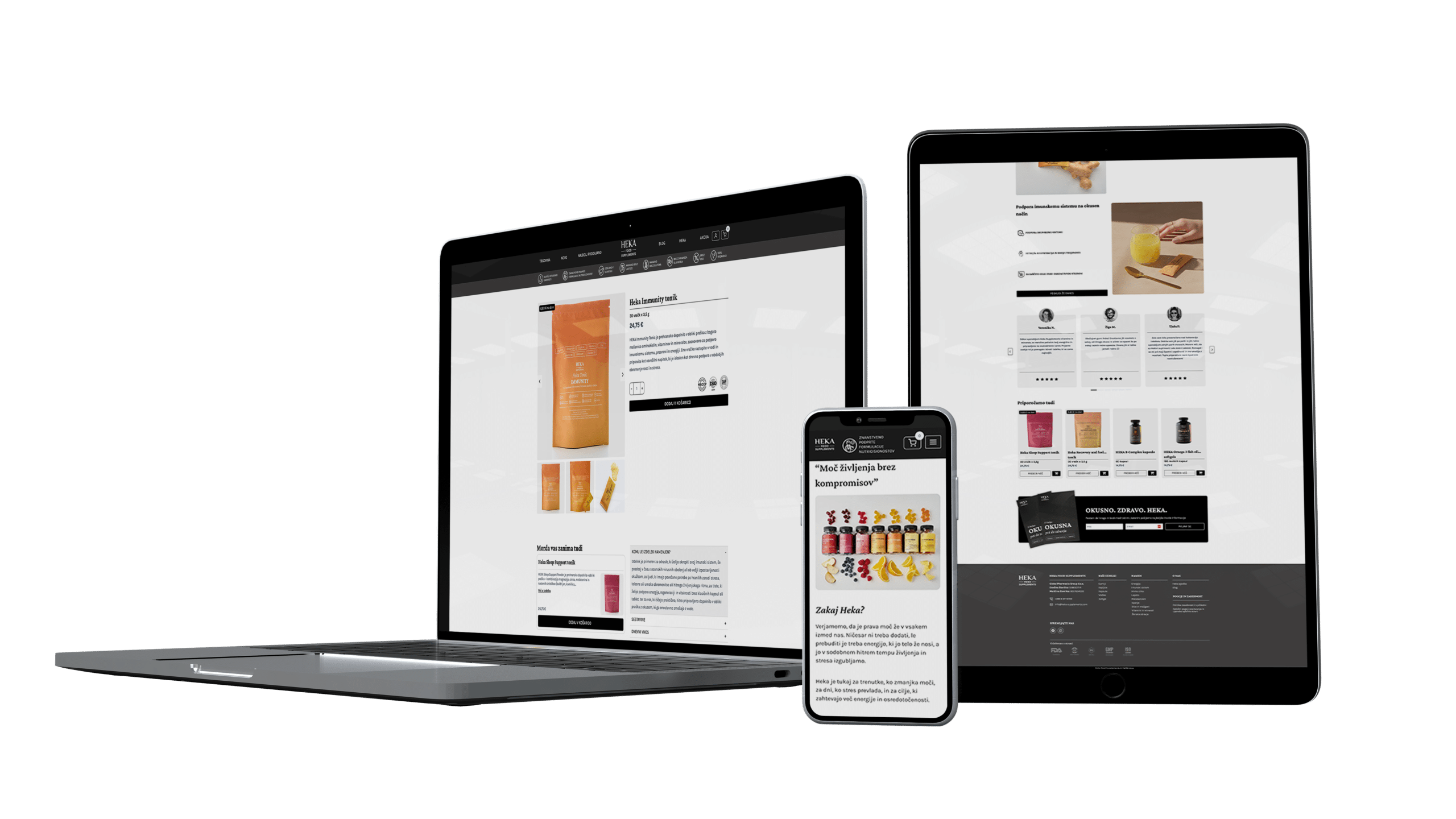
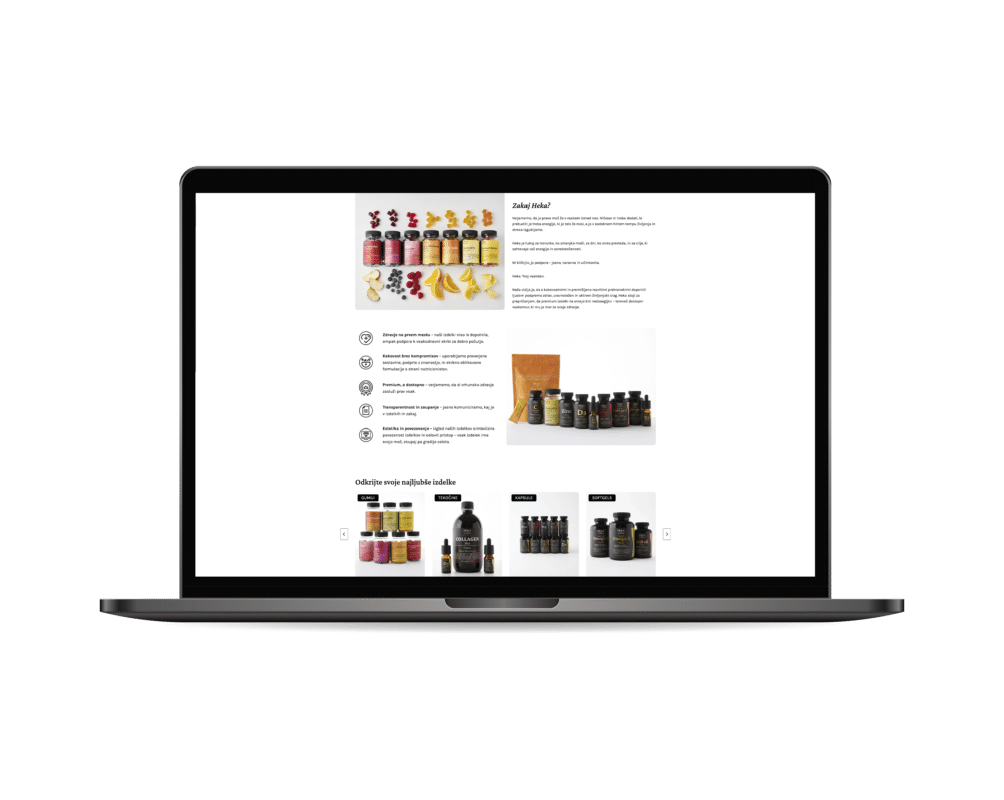
The first step was transferring the brand values onto the physical products. We developed a new color palette and typography that feel clean and professional.
- Information hierarchy: We redesigned the labels so that key details (ingredients, benefits) are immediately visible.
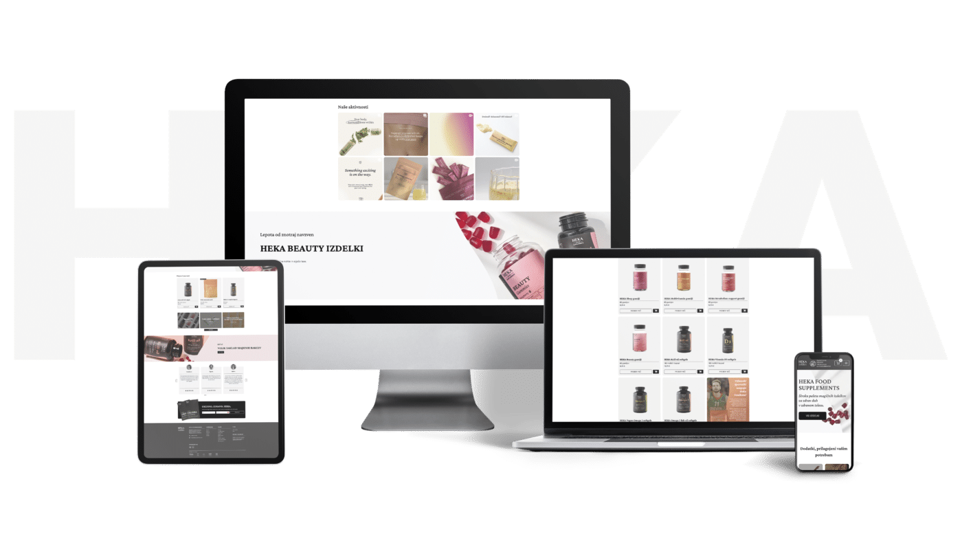
- Adaptability: The new look was successfully applied across different formats – from bottles and pouches to "drops".
- Technical refinement: We ensured everything was print-ready.